The open platform for modern hospitality
Hotel and apartment businesses run more efficiently on Apaleo today and use innovative apps to be ready for tomorrow.


Unlocking digital experiences in hospitality
Delight your guests
Traditional cloud PMS vendors bake the guest journey into their software. Create your unique guest experience with deep integrations to best-in-class tech with Apaleo's Open PMS.
Empower your staff
Automate mundane processes to give your staff more time to focus on high-impact tasks and the tools to deliver a memorable experience.
Modernize your tech
Fast, reliable cloud services eliminate software upgrade costs and maintenance interruptions. Roll your own software with Apaleo’s industry-leading APIs, or find the latest integrations in the Apaleo Store.
For us, it was crucial to have a flexible property management platform that can quickly connect with applications that we need or develop in-house. Apaleo is simple to set up and gives us the most open solution on the market to connect everything we need to run our business efficiently.
As seen in


The new standard in hospitality technology


Secure & Compliant
Apaleo exceeds modern standards for data protection including GDPR, PCI, PSD2 and SOC 2 compliance.

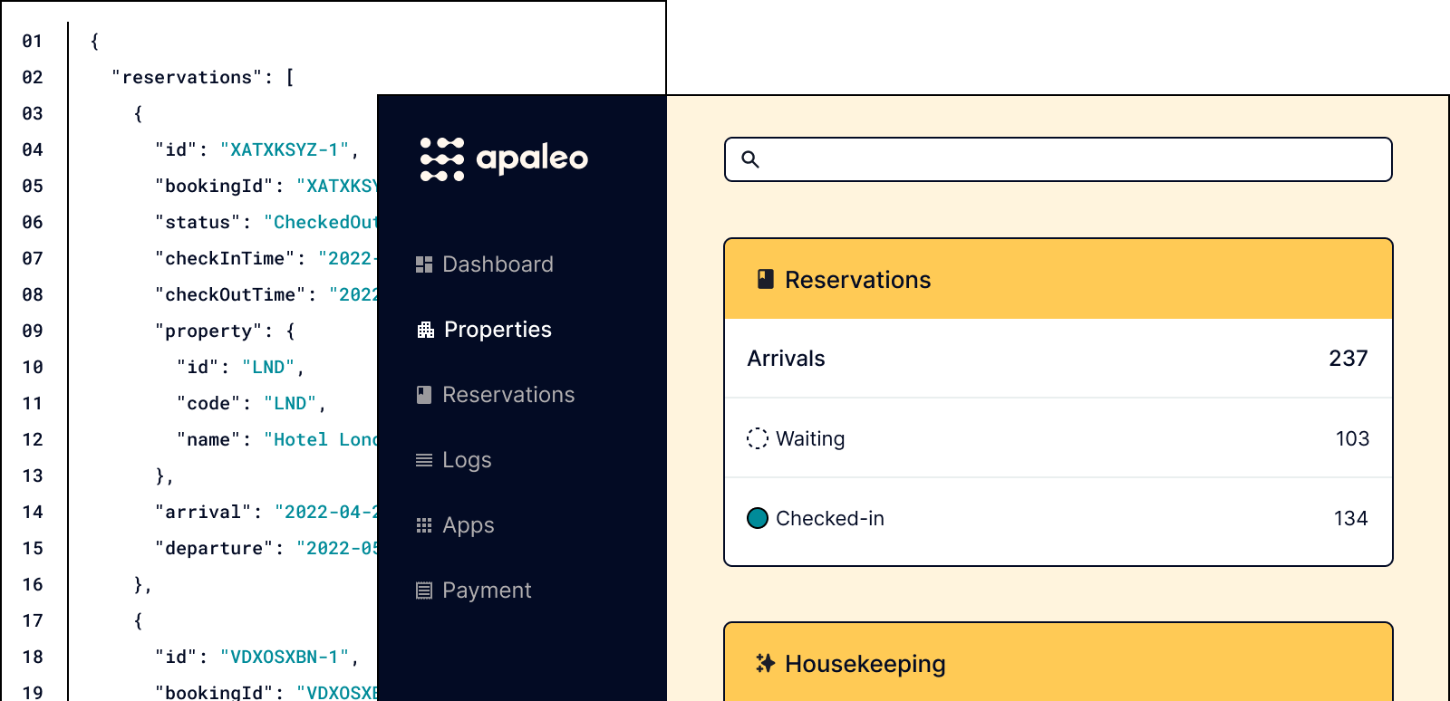
The only API-first hospitality platform
Fast, iterative development
Easy to learn
Own your data
Real-time products
Low-touch prototyping
Fast and reliable